

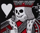
Thanks for the feedback! Yours is a good example of the kind of things we're going for. Not improved to the point that the originals are redundant, but just different enough to still work with the cards inside and nice enough that people will want to get them as part of the campaign.Fes wrote: ↑Fri Sep 04, 2020 10:23 am Ultramarine foil on blue matte is nice sure. Gold fish, okay they're gold fish but that's the only real point of contrast and it's a bit garish against the blues. There is no binder to bring it all together and make my eyes say, yum. Me paws want to play with the fishie fish on the original tuck. This variant I see here is not so much the case because my eyes slide off the tuck back. I feel the original is superior to this version.
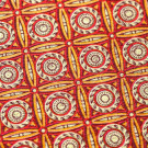
The wave edition tuck shown here is pretty great. I think it's better than the first wave edition tuck. The colors contrast and yes my eyes say yum. I'd like to put me paw into it and splish splash a bit.
They're exclusive to KS and we will only print what we need, so they might end up with really short run numbers in the 300 range.
It's still going well, so we do have a proper 3rd deck planned... we'll just have to wait and see how the next few days go
PS I agree that the red on blue is something special, especially with the foil we've chosen for it. I like the gold too, but the red is definitely more unique


 . As always a great example for the community.


 .
.
 .
.

