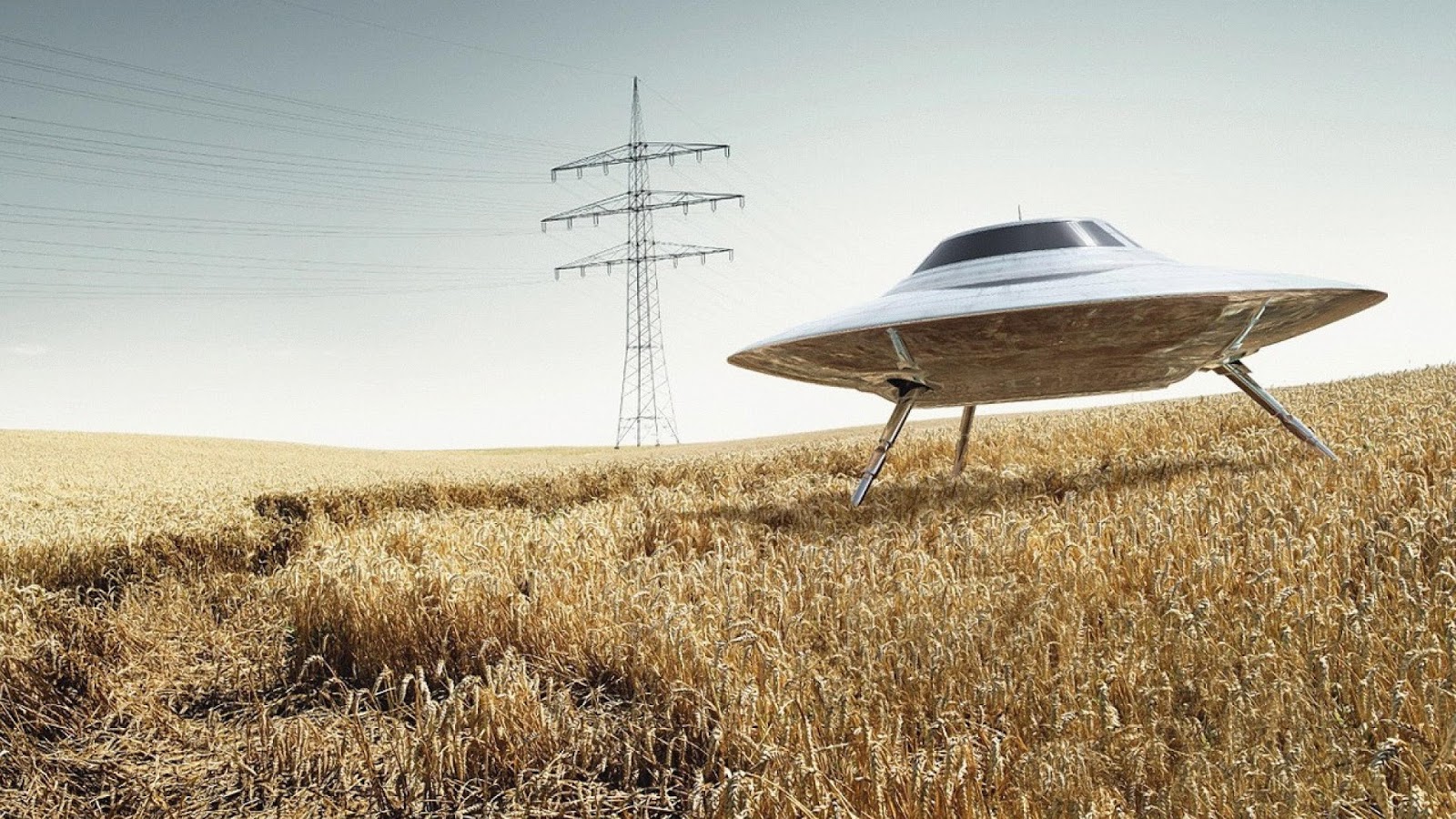
My two cents:
Left Ace
Right (dark) back
Left UFO(no legs)
I really like how you worked the symbol for mercury into the design. The project is really coming along.
The Planets — Vanda Artists Series
-
flashcards
- Member

- Posts: 728
- Joined: Mon Jan 19, 2015 9:02 pm
- Cardist: Yes
- Collector: Yes
- Decks Owned: 600
- Location: Corvallis, Oregon
- Has thanked: 192 times
- Been thanked: 185 times
- Contact:
-
Kage X

- Member
- Posts: 214
- Joined: Tue Jan 10, 2017 11:54 am
- Collector: Yes
- Player: Yes
- Decks Owned: 1000
- Location: Malaysia
- Has thanked: 82 times
- Been thanked: 49 times
Re: The Planets — Vanda Artists Series
My choice as well.flashcards wrote:My two cents:
Left Ace
Right (dark) back
Left UFO(no legs)
Launch this quickly, please.
-
MagikFingerz

- Site Admin

- Posts: 7833
- Joined: Mon Sep 24, 2012 7:32 pm
- Cardist: Yes
- Collector: Yes
- Player: Yes
- Magician: Yes
- White Whale: Sawdust and Delicious + uncuts
- Location: Norway
- Has thanked: 1841 times
- Been thanked: 1605 times
- Contact:
Re: The Planets — Vanda Artists Series
Same here.flashcards wrote:My two cents:
Left Ace
Right (dark) back
Left UFO(no legs)
-
Wanderer

- Member
- Posts: 76
- Joined: Sun Feb 26, 2017 4:20 am
- Cardist: Yes
- Collector: Yes
- Player: Yes
- Has thanked: 20 times
- Been thanked: 3 times
Re: The Planets — Vanda Artists Series
Lovely, but as something very simple. And the reverse side of the card does not represent anything special. But in general, not bad. Reminiscent of cartoon characters.
-
montecarlojoe

- Moderator

- Posts: 2529
- Joined: Mon Jun 24, 2013 7:10 am
- Collector: Yes
- Player: Yes
- White Whale: Avant Guard UL Gr - No17 Crown
- Decks Owned: 690
- Location: Portsmouth, England
- Has thanked: 253 times
- Been thanked: 268 times
- Contact:
Re: The Planets — Vanda Artists Series
I think that's the idea - 50's / 60's space race era stylising . For me it's pitch perfect
-
RichK

- Member
- Posts: 1797
- Joined: Tue Nov 17, 2015 12:06 pm
- Collector: Yes
- Decks Owned: 250
- Has thanked: 791 times
- Been thanked: 447 times
Re: The Planets — Vanda Artists Series
I'm for...
Left Ace
Either back color
Left UFO...like how it "boxes" the planet.
Question, should the card back match the legs/no legs UFO? I hope it will. The white and "brown" left picture would be great back but I imagine printing would be impossible.
Left Ace
Either back color
Left UFO...like how it "boxes" the planet.
Question, should the card back match the legs/no legs UFO? I hope it will. The white and "brown" left picture would be great back but I imagine printing would be impossible.
Move on, nothing to see here.
-
davegk

- ✔ VERIFIED Designer

- Posts: 473
- Joined: Mon Oct 08, 2012 11:01 am
- Location: Oakland, CA
- Has thanked: 1 time
- Been thanked: 307 times
- Contact:
Re: The Planets — Vanda Artists Series
Thanks for the feedback, guys!
We'll probably be going with a modified version of the left ace, the black back design, and the UFO without legs. The tuckbox will be foil and white ink on a black paper stock, so it won't work to have a white background for the back of the tuck.
Will keep you updated with final art decisions and deck/tuck proofs once they're printed. Not sure of launch date yet but likely in April or May.
-
JuFiN

- Member
- Posts: 652
- Joined: Mon May 23, 2016 12:07 pm
- Collector: Yes
- Player: Yes
- White Whale: Delirium Signature
- Decks Owned: 1000
- Location: Massachusetts
- Has thanked: 89 times
- Been thanked: 206 times
Re: The Planets — Vanda Artists Series
Would it be possible to add white I to the card back as you have for the tuck box image? I think it looks better than just gold on black.
-
MagikFingerz
- Site Admin
- Posts: 7833
- Joined: Mon Sep 24, 2012 7:32 pm
- Cardist: Yes
- Collector: Yes
- Player: Yes
- Magician: Yes
- White Whale: Sawdust and Delicious + uncuts
- Location: Norway
- Has thanked: 1841 times
- Been thanked: 1605 times
- Contact:
Re: The Planets — Vanda Artists Series
I second this motion.JuFiN wrote:Would it be possible to add white I to the card back as you have for the tuck box image? I think it looks better than just gold on black.
-
RichK
- Member
- Posts: 1797
- Joined: Tue Nov 17, 2015 12:06 pm
- Collector: Yes
- Decks Owned: 250
- Has thanked: 791 times
- Been thanked: 447 times
Re: The Planets — Vanda Artists Series
I approve of this request too if it's possible to do. I half-assed asked you this question above.JuFiN wrote:Would it be possible to add white I to the card back as you have for the tuck box image? I think it looks better than just gold on black.
Move on, nothing to see here.
-
davegk
- ✔ VERIFIED Designer
- Posts: 473
- Joined: Mon Oct 08, 2012 11:01 am
- Location: Oakland, CA
- Has thanked: 1 time
- Been thanked: 307 times
- Contact:
Re: The Planets — Vanda Artists Series
Thanks for the suggestion! I had actually been considering this already and I think we will probably do it since there seems to be unanimous interest so far.JuFiN wrote:Would it be possible to add white I to the card back as you have for the tuck box image? I think it looks better than just gold on black.
-
serubi

- Member
- Posts: 105
- Joined: Sun Jan 08, 2017 11:55 am
- Cardist: Yes
- Collector: Yes
- Player: Yes
- Has thanked: 10 times
- Been thanked: 35 times
Re: The Planets — Vanda Artists Series
This is such a cool idea! I'm completely hooked. Also a smart idea with a collection that makes a planet when it's complete. That'll definitely make people want them all 
-
davegk
- ✔ VERIFIED Designer
- Posts: 473
- Joined: Mon Oct 08, 2012 11:01 am
- Location: Oakland, CA
- Has thanked: 1 time
- Been thanked: 307 times
- Contact:
Re: The Planets — Vanda Artists Series
Hey guys,
Quick update...just wanted to post the new version of the ace of spades...
Quick update...just wanted to post the new version of the ace of spades...
-
montecarlojoe
- Moderator
- Posts: 2529
- Joined: Mon Jun 24, 2013 7:10 am
- Collector: Yes
- Player: Yes
- White Whale: Avant Guard UL Gr - No17 Crown
- Decks Owned: 690
- Location: Portsmouth, England
- Has thanked: 253 times
- Been thanked: 268 times
- Contact:
Re: The Planets — Vanda Artists Series
You probably don't want multiple AoS but it'd be cool if the sun got smaller the further away the planet is...
-
davegk
- ✔ VERIFIED Designer
- Posts: 473
- Joined: Mon Oct 08, 2012 11:01 am
- Location: Oakland, CA
- Has thanked: 1 time
- Been thanked: 307 times
- Contact:
Re: The Planets — Vanda Artists Series
Hmm...that's an interesting idea to consider—thanks!montecarlojoe wrote:You probably don't want multiple AoS but it'd be cool if the sun got smaller the further away the planet is...
-
davegk
- ✔ VERIFIED Designer
- Posts: 473
- Joined: Mon Oct 08, 2012 11:01 am
- Location: Oakland, CA
- Has thanked: 1 time
- Been thanked: 307 times
- Contact:
Re: The Planets — Vanda Artists Series
Hey all,
We're getting close to finalizing the designs. Here's a quick poll for you...we've been working on the back design a bit to try to incorporate a black background but also have white borders. Below are 4 options Srdjan created. Please let me know which one you like best.
Also we have a couple additional surprises that will be revealed when the project launches.
Thanks!
-David
-
MagikFingerz
- Site Admin
- Posts: 7833
- Joined: Mon Sep 24, 2012 7:32 pm
- Cardist: Yes
- Collector: Yes
- Player: Yes
- Magician: Yes
- White Whale: Sawdust and Delicious + uncuts
- Location: Norway
- Has thanked: 1841 times
- Been thanked: 1605 times
- Contact:
Re: The Planets — Vanda Artists Series
Of the 4 options I would have to vote for number 1.
HOWEVER, I feel like there's a missed opportunity here. What I would like to see is the gold swirls of the outer design to extend slightly over the white borders, like the already do a bit on the long edge, but all the way around. This would be complemented by either A: removing the outer frame of the back design altogether, or still having it in the background but white (like in option 2).
Let me know if that doesn't make sense, and I can try to illustrate.
-
shermjack

- ✔ VERIFIED Seller

- Posts: 1924
- Joined: Mon Feb 23, 2015 7:39 pm
- Collector: Yes
- Has thanked: 1746 times
- Been thanked: 1031 times
- Contact:
Re: The Planets — Vanda Artists Series
I agree that 1 is the best of the 4, but would be interested in seeing Tom's suggestion if possible 
A deck a day helps keep the addiction at bay!
Check out my collection on Instagram @caratcasecreations
Check out my collection on Instagram @caratcasecreations
-
shaitani

- Member
- Posts: 303
- Joined: Thu Oct 27, 2016 4:58 pm
- Cardist: Yes
- Collector: Yes
- White Whale: Artistic Spring
- Has thanked: 142 times
- Been thanked: 126 times
Re: The Planets — Vanda Artists Series
I may be alone on this, but I actually like #4 the most, followed by #2.
#1 is the safest because every deck does it that way and it looks fine. But I like #4 because it creates two levels of border in a way we don't really see very often, and I thought it was cool and fitting. #2 I preferred because it did as MagikFingerz was describing, it kind of allows some more of the design to creep outside of the border (or at least it simulates it).
#1 is the safest because every deck does it that way and it looks fine. But I like #4 because it creates two levels of border in a way we don't really see very often, and I thought it was cool and fitting. #2 I preferred because it did as MagikFingerz was describing, it kind of allows some more of the design to creep outside of the border (or at least it simulates it).
-
TGunitedcardists

- Member
- Posts: 591
- Joined: Fri May 16, 2014 5:57 am
- Been thanked: 147 times
Re: The Planets — Vanda Artists Series
None of above. The hat on the inner diamond is exactly the same making the back one way. In addition, the planet in the middle makes it one way.
-
davegk
- ✔ VERIFIED Designer
- Posts: 473
- Joined: Mon Oct 08, 2012 11:01 am
- Location: Oakland, CA
- Has thanked: 1 time
- Been thanked: 307 times
- Contact:
Re: The Planets — Vanda Artists Series
Thanks for the feedback!
@MagikFingerz: I appreciate the suggestions but I'm very happy with the current design and don't want to go down the path of reworking the entire frame (and also redesigning the back of the tuckbox)—just deciding on coloring fills at the moment.
@TGunitedcardists: Good catch on the mirrored UFO...will make sure this gets adjusted. As for the planet being one way, I've been aware of this from the beginning and made the decision to proceed with a one way back design.
Before I posted the images, I was definitely leaning towards either #1 or #4 and after some thought (and in the interest of Vanda's pursuit to produce unique creations that stand out from other decks), I think we'll be going with #4. @shaitani: I agree that #1 is the safe choice...it is most in alignment with many other decks out there already, and that's part of my decision to go in a different direction.
Stay tuned for more updates! The last piece of the design is the pip symbols, which I'll be working on soon. I'll be sharing images of those when they're ready.
-David
-
MagikFingerz
- Site Admin
- Posts: 7833
- Joined: Mon Sep 24, 2012 7:32 pm
- Cardist: Yes
- Collector: Yes
- Player: Yes
- Magician: Yes
- White Whale: Sawdust and Delicious + uncuts
- Location: Norway
- Has thanked: 1841 times
- Been thanked: 1605 times
- Contact:
Re: The Planets — Vanda Artists Series
Well, it's your choice, David.
For me, that lessens my interest in this series quite a bit; option 4 was the one I liked the least. Oh well.
For me, that lessens my interest in this series quite a bit; option 4 was the one I liked the least. Oh well.
-
RichK
- Member
- Posts: 1797
- Joined: Tue Nov 17, 2015 12:06 pm
- Collector: Yes
- Decks Owned: 250
- Has thanked: 791 times
- Been thanked: 447 times
Re: The Planets — Vanda Artists Series
I know I'm late to the vote but I like MagikFingerz idea of removing the "light tan" parts on #2 to show more dark curves, if that's how I read his idea.
#4 makes the dark area look too small to me, almost like you have a massive white border. I know you've chosen #4 and hopefully it's just this color scheme for Mercury that makes it look like a big white border and the other planets will have a darker looking color.
#4 makes the dark area look too small to me, almost like you have a massive white border. I know you've chosen #4 and hopefully it's just this color scheme for Mercury that makes it look like a big white border and the other planets will have a darker looking color.
Move on, nothing to see here.
-
shaitani
- Member
- Posts: 303
- Joined: Thu Oct 27, 2016 4:58 pm
- Cardist: Yes
- Collector: Yes
- White Whale: Artistic Spring
- Has thanked: 142 times
- Been thanked: 126 times
Re: The Planets — Vanda Artists Series
Why not the best of both worlds? ie go #4 and get the outside border to be black. That way it doesn't look like a big white border, and it actually frames it in another layer that I personally think looks even better.
Forgive the blasphemy of editing an artists work, I just 5 second photoshopped this just to get my idea across:

If this photo-edit is inappropriate, please let me know, I'll remove it and just try to describe it with words.
Anyway, I'm curious to people's thoughts on this, I don't think I've seen this type of design anywhere either and it shooould address what people didn't like about #4.
Forgive the blasphemy of editing an artists work, I just 5 second photoshopped this just to get my idea across:
If this photo-edit is inappropriate, please let me know, I'll remove it and just try to describe it with words.
Anyway, I'm curious to people's thoughts on this, I don't think I've seen this type of design anywhere either and it shooould address what people didn't like about #4.
-
JuFiN
- Member
- Posts: 652
- Joined: Mon May 23, 2016 12:07 pm
- Collector: Yes
- Player: Yes
- White Whale: Delirium Signature
- Decks Owned: 1000
- Location: Massachusetts
- Has thanked: 89 times
- Been thanked: 206 times
Re: The Planets — Vanda Artists Series
This looks fantastic! Use thisshaitani wrote:Why not the best of both worlds? ie go #4 and get the outside border to be black. That way it doesn't look like a big white border, and it actually frames it in another layer that I personally think looks even better.
Forgive the blasphemy of editing an artists work, I just 5 second photoshopped this just to get my idea across:
If this photo-edit is inappropriate, please let me know, I'll remove it and just try to describe it with words.
Anyway, I'm curious to people's thoughts on this, I don't think I've seen this type of design anywhere either and it shooould address what people didn't like about #4.
-
shermjack
- ✔ VERIFIED Seller
- Posts: 1924
- Joined: Mon Feb 23, 2015 7:39 pm
- Collector: Yes
- Has thanked: 1746 times
- Been thanked: 1031 times
- Contact:
Re: The Planets — Vanda Artists Series
Nice job, Shaitani! +1 for his suggested backshaitani wrote:Why not the best of both worlds? ie go #4 and get the outside border to be black. That way it doesn't look like a big white border, and it actually frames it in another layer that I personally think looks even better.
Forgive the blasphemy of editing an artists work, I just 5 second photoshopped this just to get my idea across:
If this photo-edit is inappropriate, please let me know, I'll remove it and just try to describe it with words.
Anyway, I'm curious to people's thoughts on this, I don't think I've seen this type of design anywhere either and it shooould address what people didn't like about #4.
A deck a day helps keep the addiction at bay!
Check out my collection on Instagram @caratcasecreations
Check out my collection on Instagram @caratcasecreations
-
MagikFingerz
- Site Admin
- Posts: 7833
- Joined: Mon Sep 24, 2012 7:32 pm
- Cardist: Yes
- Collector: Yes
- Player: Yes
- Magician: Yes
- White Whale: Sawdust and Delicious + uncuts
- Location: Norway
- Has thanked: 1841 times
- Been thanked: 1605 times
- Contact:
Re: The Planets — Vanda Artists Series
That does look pretty darn good. Nice one, shaitani!
I would suggest having the top/bottom half-circles tweaked in some way, but that probably goes without saying.
I would suggest having the top/bottom half-circles tweaked in some way, but that probably goes without saying.
-
flashcards
- Member
- Posts: 728
- Joined: Mon Jan 19, 2015 9:02 pm
- Cardist: Yes
- Collector: Yes
- Decks Owned: 600
- Location: Corvallis, Oregon
- Has thanked: 192 times
- Been thanked: 185 times
- Contact:
Re: The Planets — Vanda Artists Series
I hate to try and force something on a creator but this is by far the best version of the back.
-
RichK
- Member
- Posts: 1797
- Joined: Tue Nov 17, 2015 12:06 pm
- Collector: Yes
- Decks Owned: 250
- Has thanked: 791 times
- Been thanked: 447 times
Re: The Planets — Vanda Artists Series
Nice work!shaitani wrote:Why not the best of both worlds? ie go #4 and get the outside border to be black. That way it doesn't look like a big white border, and it actually frames it in another layer that I personally think looks even better.
Forgive the blasphemy of editing an artists work, I just 5 second photoshopped this just to get my idea across:
If this photo-edit is inappropriate, please let me know, I'll remove it and just try to describe it with words.
Anyway, I'm curious to people's thoughts on this, I don't think I've seen this type of design anywhere either and it shooould address what people didn't like about #4.
Move on, nothing to see here.
-
davegk
- ✔ VERIFIED Designer
- Posts: 473
- Joined: Mon Oct 08, 2012 11:01 am
- Location: Oakland, CA
- Has thanked: 1 time
- Been thanked: 307 times
- Contact:
Re: The Planets — Vanda Artists Series
@shaitani: thank you for your suggestion and mockup.
And thanks to everyone else for your feedback. I've spent some time agonizing over the decision of the back design and I even mocked up a cleaner version of what shaitani proposed (see image below). While I know that you guys have expressed enthusiasm for that design, I've decided to stick to my previous decision and go with #4 from the voting image. I realize you may be a bit disappointed by my choice, but Srdjan and I both feel that this is the strongest option from a design/aesthetic standpoint and I urge you to keep an open mind. I promise the design will grow on you, as did the original Vanda back design which initially met opposition. I've attached a couple mockups that will help give you a better idea of what this will actually look like.
More to come soon...
-David
Who is online
Users browsing this forum: No registered users and 75 guests