"We look at the present through a rear-view mirror; we walk backwards into the future."
-- Marshall McLuhan (Media Theory Giant) Decknowledgy™ (Ted) Instagram Reviews:https://www.instagram.com/decknowledgy
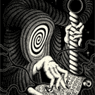
I love the artwork on the court cards and the card faces. It's sophisticated and quirky! The tuck box design is a nice match as well, but it's the card backs that have me hesitating. I'm not sure if it's too modern, or if the features are too bold/thick, or perhaps a mixture of the two. I might come around on this one, but it's a pass for now.
I don't like the one-way courts and I feel like I've been saying that a lot lately. I hope that's not a new trend... They are well drawn though. Very rustic and vintage. Which is why the back is awful. Or vice versa, however you want to look at it. Either way the backs and fronts look like they are from two completely different decks. Both very nice, respectively but together, an identity crisis.
Urgh... like most mentioned already, the combination of modern back and antique courts is awful. Even more if the borders are indeed white and the faces feature an off-white back ground. Dunno if I've ever came across a heavier disconnect than this.
Harvonsgard wrote: ↑Mon Aug 03, 2020 1:43 pmEven more if the borders are indeed white and the faces feature an off-white back ground. Dunno if I've ever came across a heavier disconnect than this.
This alone makes me cringe really really hard... those white borders are gunna be so stark compared to the off-white background of the faces which totally throws off the illusion of replicating a vintage/antique aesthetic of an old deck and the design choices of the backs desperately need to be reconsidered for more cohesiveness in style overall.
I'd really like to see these areas re-worked and wish the designer/creator the best of luck!
Harvonsgard wrote: ↑Mon Aug 03, 2020 1:43 pm
Urgh... like most mentioned already, the combination of modern back and antique courts is awful. Even more if the borders are indeed white and the faces feature an off-white back ground. Dunno if I've ever came across a heavier disconnect than this.
vasta41 wrote: ↑Mon Aug 03, 2020 12:58 pm
I don't like the one-way courts and I feel like I've been saying that a lot lately. I hope that's not a new trend...
Well, this trend is more than five centuries old ...
This is a travesty. The card faces themselves are great, I'm completely on board for that, obviously they know how to effectively re-work those old existing artworks. But the tuck and backs are so clearly done by somebody with only a basic knowledge of photoshop, one of the worst things for me is when you can see that they've used the bevel/emboss function or similar. And the gradient applied to the whole thing means the backs aren't symmetrical. I wouldn't call them modern, I'd just call them bad. They should fit the style of the faces first of all, even just remove the shading, remove the gradient and desaturate the colours a bit and see how that looks, I'd be interested to see.