Invasion - Live on KS
-
- Member
- Posts: 950
- Joined: Tue Oct 16, 2018 5:44 pm
- Has thanked: 165 times
- Been thanked: 593 times
Invasion - Live on KS
This deck reminds me of a cross between Omnia and The Planets.
✔ Custom Courts
✔ Custom Pips
✔ Embossed and foil Tuck
✔ Printing by EPCC
✔ Custom Courts
✔ Custom Pips
✔ Embossed and foil Tuck
✔ Printing by EPCC
Full Deck Scans: https://cardscans.piwigo.com
-
- ✔ VERIFIED Designer
- Posts: 1274
- Joined: Sat Mar 19, 2016 10:57 am
- Has thanked: 485 times
- Been thanked: 691 times
Re: Invasion - Live on KS
Exactly my sentiments. When I looked at it, I felt I am looking at a deck that has taken inspiration from Thirdway Industries projects. When I looked closely at the courts, felt I was looking at Planets replica.macstrat wrote:This deck reminds me of a cross between Omnia and The Planets.
- Räpylätassu
- Member
- Posts: 2642
- Joined: Thu Feb 19, 2015 7:29 pm
- Collector: Yes
- Player: Yes
- White Whale: Black Palekh from 1937
- Decks Owned: 700
- Location: Kuopio a ka The Bellybutton of the World
- Has thanked: 840 times
- Been thanked: 1341 times
Re: Invasion - Live on KS
I like what I see, truly some nice artwork. I also get Giovanni wibes from this, but I have to emphasize that it's similar but not a copy cat look. I don't see the Planets comparison, I don't think this project looks very similar to them.
I like it.
I like it.
Left my heart in SIERRA MADRE
"Finding it... that's not the hard part. It's letting go."
"One makes a trip by day, but by night one sets out on a journey." -Moominmamma
I dream of a world where wars are fought only by having dance offs. I also dream that a Finnish playing card designer would exist. The former seems more likely to happend.
Money can't buy you happiness, but it can buy you a penguin. Have you ever met a sad person with a penguin?
Are lobsters mermaids to scorpions?
"I did not hit her, it's not true, it's bullsh*t, I did not hit her, I did naaaht! Oh hai Mark!"
MY TRADELIST
MY TOP 150 DECKS
MY PORTFOLIO52 PAGE
-
- Member
- Posts: 950
- Joined: Tue Oct 16, 2018 5:44 pm
- Has thanked: 165 times
- Been thanked: 593 times
Re: Invasion - Live on KS
I pledged for now. While derivative, they do look well done, and on a shelf would make a good transition between the other 2 sets. There are some things in there that also tell me he has done his homework in regards to production and design, like EPCC as a printer and offering uncut sheets.guru wrote:Exactly my sentiments. When I looked at it, I felt I am looking at a deck that has taken inspiration from Thirdway Industries projects. When I looked closely at the courts, felt I was looking at Planets replica.macstrat wrote:This deck reminds me of a cross between Omnia and The Planets.
Full Deck Scans: https://cardscans.piwigo.com
-
- Deck Artist
- Posts: 125
- Joined: Wed Mar 02, 2016 8:20 am
- Has thanked: 16 times
- Been thanked: 58 times
- Contact:
Re: Invasion - Live on KS
I guess those index "numbers" could make using these more challenging than it would need to be. I mean by all means take the indices off if you want, but if you have them on there, the whole point is that they make the cards easier to use. And I wonder what the diamonds are supposed to be. Am I not seeing it? The two black suits look relatively normal, the heart looks almost like a heart (but also quite like a spade), but I don't get the diamonds at all.
- shermjack
- ✔ VERIFIED Seller
- Posts: 1894
- Joined: Mon Feb 23, 2015 7:39 pm
- Collector: Yes
- Has thanked: 1651 times
- Been thanked: 950 times
- Contact:
Re: Invasion - Live on KS
Agreed with the Diamonds, maybe if they rotated them 45degrees, then they would look more appropriateshimmering wrote:I guess those index "numbers" could make using these more challenging than it would need to be. I mean by all means take the indices off if you want, but if you have them on there, the whole point is that they make the cards easier to use. And I wonder what the diamonds are supposed to be. Am I not seeing it? The two black suits look relatively normal, the heart looks almost like a heart (but also quite like a spade), but I don't get the diamonds at all.
A deck a day helps keep the addiction at bay!
Check out my collection on Instagram @caratcasecreations
- CupcakeBaron
- Member
- Posts: 279
- Joined: Mon Nov 13, 2017 8:34 pm
- Has thanked: 18 times
- Been thanked: 52 times
Re: Invasion - Live on KS
To me it looks like Gio made an Avengers Infinity War deck, the king of diamonds looks like Thanos' little brother roflRäpylätassu wrote:I like what I see, truly some nice artwork. I also get Giovanni wibes from this, but I have to emphasize that it's similar but not a copy cat look. I don't see the Planets comparison, I don't think this project looks very similar to them.
I like it.
-
- Member
- Posts: 810
- Joined: Tue Aug 14, 2018 3:57 am
- Collector: Yes
- Decks Owned: 816
- Has thanked: 129 times
- Been thanked: 181 times
Re: Invasion - Live on KS
I am not really seeing that much of the Planets, to me they are unmistakingly Gio-style with less exposed lady parts and more skulls (not dissimilar to Chris Ovdiyenko Calaveras).
My collection https://portfolio52.com/profile/13601/collection
My tradelist https://portfolio52.com/profile/13601/tradelist
-
- Member
- Posts: 950
- Joined: Tue Oct 16, 2018 5:44 pm
- Has thanked: 165 times
- Been thanked: 593 times
Re: Invasion - Live on KS
Makes it look more alien?RichK wrote:Nope. So much gray makes them look bad. Why not numbers, not dots, on number cards?
Full Deck Scans: https://cardscans.piwigo.com
- drunkbear8327
- Initiate
- Posts: 23
- Joined: Sat Dec 01, 2018 10:23 pm
- Cardist: Yes
- Magician: Yes
- Decks Owned: 17
- Location: Carmichael
- Has thanked: 1 time
- Been thanked: 2 times
Invasion Playing Cards
Hey guys,
Please consider checking out this Kickstarter, that my dad made.
http://www.kickstarter.com/projects/for ... ying-cards" onclick="window.open(this.href);return false;" onclick="window.open(this.href);return false;
Thank you.
Please consider checking out this Kickstarter, that my dad made.
http://www.kickstarter.com/projects/for ... ying-cards" onclick="window.open(this.href);return false;" onclick="window.open(this.href);return false;
Thank you.
- Attachments
-
- 9bc8b879fdc9984f10b6063add515193_original.jpg (58.97 KiB) Viewed 1846 times
- drunkbear8327
- Initiate
- Posts: 23
- Joined: Sat Dec 01, 2018 10:23 pm
- Cardist: Yes
- Magician: Yes
- Decks Owned: 17
- Location: Carmichael
- Has thanked: 1 time
- Been thanked: 2 times
Re: Invasion - Live on KS
The diamond is the white square between the red outlines.shimmering wrote:I guess those index "numbers" could make using these more challenging than it would need to be. I mean by all means take the indices off if you want, but if you have them on there, the whole point is that they make the cards easier to use. And I wonder what the diamonds are supposed to be. Am I not seeing it? The two black suits look relatively normal, the heart looks almost like a heart (but also quite like a spade), but I don't get the diamonds at all.
- Merlebird
- Member
- Posts: 1082
- Joined: Thu Feb 01, 2018 5:17 pm
- Collector: Yes
- White Whale: Moon Prism + Dondorf Saks
- Decks Owned: 212
- Location: Cincinnati, OH
- Has thanked: 247 times
- Been thanked: 415 times
Re: Invasion - Live on KS
I always like to see designers push the envelope for pip layouts and indices, so I can dig that aspect. The courts just really aren't my thing. Too bad.
- rousselle
- Site Admin
- Posts: 4773
- Joined: Thu Aug 01, 2013 11:35 pm
- Collector: Yes
- Player: Yes
- Magician: Yes
- Has thanked: 7234 times
- Been thanked: 2475 times
Re: Invasion - Live on KS
Merged the start of a separate thread; sorry if it's introducing any confusion here. Welcome, drunkbear8327 to the UC!
This space intentionally left blank.
- drunkbear8327
- Initiate
- Posts: 23
- Joined: Sat Dec 01, 2018 10:23 pm
- Cardist: Yes
- Magician: Yes
- Decks Owned: 17
- Location: Carmichael
- Has thanked: 1 time
- Been thanked: 2 times
Re: Invasion - Live on KS
For early bird one deck, it was $14 for a deck and $6 delivery (14+6=20).Stepchild wrote:At $20 shipped for a single early bird deck I can quite easily PASS
Right now all early birds single deck are sold out. However you can still buy a nonearly-bird deck for $16 plus $6 for delivery (at the "Checkout" it would say $22 because it would add the price of the deck and delivery)
sorry for inconvenience.
- drunkbear8327
- Initiate
- Posts: 23
- Joined: Sat Dec 01, 2018 10:23 pm
- Cardist: Yes
- Magician: Yes
- Decks Owned: 17
- Location: Carmichael
- Has thanked: 1 time
- Been thanked: 2 times
Re: Invasion - Live on KS
It is not gray, it is silver metal ink.RichK wrote:Nope. So much gray makes them look bad. Why not numbers, not dots, on number cards?
if you go on the page it is stated as one of the first sentences.
Sorry if it wasn't clear.
- PipChick
- Moderator
- Posts: 2001
- Joined: Sun Mar 11, 2018 8:20 am
- White Whale: StrangeLove + Italian Cats
- Decks Owned: 200
- Location: Internet
- Has thanked: 465 times
- Been thanked: 1101 times
- Contact:
Re: Invasion - Live on KS
Hi drunkbear8327! a couple quick questions: so.... was it 8 cows? or 9?? and also.... will those super cool tinfoil hats be available as add-ons?? lol
But in all seriousness, the overall design in general is pretty solid and the only area that I might consider in need of improvement would be changing the dot indices you currently have to represent the cards' value to actual numbers so they would be more practical in use for gameplay. The pip orientation of the diamond suit might also lend itself better if rotated 45 degrees to be slightly more recognizable on first glance. Tbh, the originality of the custom pips themselves don't really bother me - in fact, I quite like them; they feel cohesive to the theme and are definitely different but I'm still able to distinguish the 4 suits without difficulty.
For a first-time deck creator, this is pretty impressive; unfortunately though, it's not a theme/concept that particularly appeals to me personally, but I am excited to see what else y'all come up with in the future
Congrats on the launch - the campaign has already started off strong and I'm sure will reach the goal in no time. Regardless, best of luck!
and welcome to UC
- CupcakeBaron
- Member
- Posts: 279
- Joined: Mon Nov 13, 2017 8:34 pm
- Has thanked: 18 times
- Been thanked: 52 times
Re: Invasion - Live on KS
That may be the case but in my experience silver metallic ink doesn't translate that well and still tends to look grey in person.drunkbear8327 wrote:It is not gray, it is silver metal ink.RichK wrote:Nope. So much gray makes them look bad. Why not numbers, not dots, on number cards?
if you go on the page it is stated as one of the first sentences.
Sorry if it wasn't clear.
- drunkbear8327
- Initiate
- Posts: 23
- Joined: Sat Dec 01, 2018 10:23 pm
- Cardist: Yes
- Magician: Yes
- Decks Owned: 17
- Location: Carmichael
- Has thanked: 1 time
- Been thanked: 2 times
Re: Invasion - Live on KS
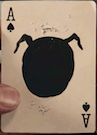
The aces are intended as "Spaceships" for 4 different alien races. And suit pips are little representations of themshermjack wrote:Agreed with the Diamonds, maybe if they rotated them 45degrees, then they would look more appropriateshimmering wrote:I guess those index "numbers" could make using these more challenging than it would need to be. I mean by all means take the indices off if you want, but if you have them on there, the whole point is that they make the cards easier to use. And I wonder what the diamonds are supposed to be. Am I not seeing it? The two black suits look relatively normal, the heart looks almost like a heart (but also quite like a spade), but I don't get the diamonds at all.
If you look at the aces first the pips will make more sense, plus they were stylized to look more "alien like".
- drunkbear8327
- Initiate
- Posts: 23
- Joined: Sat Dec 01, 2018 10:23 pm
- Cardist: Yes
- Magician: Yes
- Decks Owned: 17
- Location: Carmichael
- Has thanked: 1 time
- Been thanked: 2 times
Re: Invasion - Live on KS
The argument about cows is still going. As for the hats, sadly we cannot take them off because aliens will read our minds and find out that we are aware of their plans.PipChick wrote:Hi drunkbear8327! a couple quick questions: so.... was it 8 cows? or 9?? and also.... will those super cool tinfoil hats be available as add-ons?? lol
But in all seriousness, the overall design in general is pretty solid and the only area that I might consider in need of improvement would be changing the dot indices you currently have to represent the cards' value to actual numbers so they would be more practical in use for gameplay. The pip orientation of the diamond suit might also lend itself better if rotated 45 degrees to be slightly more recognizable on first glance. Tbh, the originality of the custom pips themselves don't really bother me - in fact, I quite like them; they feel cohesive to the theme and are definitely different but I'm still able to distinguish the 4 suits without difficulty.
For a first-time deck creator, this is pretty impressive; unfortunately though, it's not a theme/concept that particularly appeals to me personally, but I am excited to see what else y'all come up with in the future
Congrats on the launch - the campaign has already started off strong and I'm sure will reach the goal in no time. Regardless, best of luck!
and welcome to UC
As for the numbers go, don't worry just follow the Kickstarter and Instagram accounts to not miss out on some IMPORTANT UPDATES
Thank you for your feedback.
- drunkbear8327
- Initiate
- Posts: 23
- Joined: Sat Dec 01, 2018 10:23 pm
- Cardist: Yes
- Magician: Yes
- Decks Owned: 17
- Location: Carmichael
- Has thanked: 1 time
- Been thanked: 2 times
Re: Invasion - Live on KS
The silver ink looks really good in contrast with blue. Plus, for reference, it would look close to ink on National deck by theory 11. In my opinion metallic silver ink looks completely different from grey, unless you are playing at midnight with no lights onCupcakeBaron wrote:That may be the case but in my experience silver metallic ink doesn't translate that well and still tends to look grey in person.drunkbear8327 wrote:It is not gray, it is silver metal ink.RichK wrote:Nope. So much gray makes them look bad. Why not numbers, not dots, on number cards?
if you go on the page it is stated as one of the first sentences.
Sorry if it wasn't clear.
- PipChick
- Moderator
- Posts: 2001
- Joined: Sun Mar 11, 2018 8:20 am
- White Whale: StrangeLove + Italian Cats
- Decks Owned: 200
- Location: Internet
- Has thanked: 465 times
- Been thanked: 1101 times
- Contact:
Re: Invasion - Live on KS
I think the issues people are concerned with is that it seems that the color palette is a bit too monochromatic and unbalance in a few of the card designs which doesn't provide enough of a contrast between the varying shades of gray and metallic ink causing it all to mute out the entire design; take a look at the JoD - there's barely any red and the majority of the design will be with silver metallics next to only slightly varied shades of gray and with the linework so fine and no solid areas of stark black, that card may unfortunately just look like a big blob of 50 shades of gray The JoC on the other hand has at least some areas of blue that break up the solid areas of gray and metallic inks which will allow enough contrast for those details to come through and be seen.
- drunkbear8327
- Initiate
- Posts: 23
- Joined: Sat Dec 01, 2018 10:23 pm
- Cardist: Yes
- Magician: Yes
- Decks Owned: 17
- Location: Carmichael
- Has thanked: 1 time
- Been thanked: 2 times
Re: Invasion - Live on KS
The design intended to look cold, like space. the second deck (blood edition) contains more color. The blues and reds are intended as accents not primarily colors.PipChick wrote:
I think the issues people are concerned with is that it seems that the color palette is a bit too monochromatic and unbalance in a few of the card designs which doesn't provide enough of a contrast between the varying shades of gray and metallic ink causing it all to mute out the entire design; take a look at the JoD - there's barely any red and the majority of the design will be with silver metallics next to only slightly varied shades of gray and with the linework so fine and no solid areas of stark black, that card may unfortunately just look like a big blob of 50 shades of gray The JoC on the other hand has at least some areas of blue that break up the solid areas of gray and metallic inks which will allow enough contrast for those details to come through and be seen.
- PipChick
- Moderator
- Posts: 2001
- Joined: Sun Mar 11, 2018 8:20 am
- White Whale: StrangeLove + Italian Cats
- Decks Owned: 200
- Location: Internet
- Has thanked: 465 times
- Been thanked: 1101 times
- Contact:
Re: Invasion - Live on KS
Makes sense, and I totally get the cold, space feel from the palette, but metallic inks only really shine when contrasted next to non-metallic inks in bold complimentary colors - silver on gray just might not be enough... just some honest feedback worth a moment of consideration because they really are some great designs; I'd just hate to see the details washed out by less than perfect color choicesdrunkbear8327 wrote:The design intended to look cold, like space. the second deck (blood edition) contains more color. The blues and reds are intended as accents not primarily colors.
- drunkbear8327
- Initiate
- Posts: 23
- Joined: Sat Dec 01, 2018 10:23 pm
- Cardist: Yes
- Magician: Yes
- Decks Owned: 17
- Location: Carmichael
- Has thanked: 1 time
- Been thanked: 2 times
Re: Invasion - Live on KS
There is no gray ink on the card's face or back, nor on the tuck box. there is 4 colors on space deck: blue, silver, black, and red. On the blood deck here are also 4 colors: blue, gold, black and red.PipChick wrote:Makes sense, and I totally get the cold, space feel from the palette, but metallic inks only really shine when contrasted next to non-metallic inks in bold complimentary colors - silver on gray just might not be enough... just some honest feedback worth a moment of consideration because they really are some great designs; I'd just hate to see the details washed out by less than perfect color choicesdrunkbear8327 wrote:The design intended to look cold, like space. the second deck (blood edition) contains more color. The blues and reds are intended as accents not primarily colors.
Out of 2 decks 0 contain gray ink.
- PipChick
- Moderator
- Posts: 2001
- Joined: Sun Mar 11, 2018 8:20 am
- White Whale: StrangeLove + Italian Cats
- Decks Owned: 200
- Location: Internet
- Has thanked: 465 times
- Been thanked: 1101 times
- Contact:
Re: Invasion - Live on KS
okay, maybe it's my screen but what color will the JoD's face be? it doesn't seem to be white like the background... and it appears to be a just slightly lighter tone than he's uniform... and the band merging the two mirrored images also appears like a shade unlike either of those two so I guess I'm having a hard time understanding what areas are intended to be metallic inks and what areas not if there is no use of any gray??? are you intending to use different shades of metallic inks to differentiate between these areas instead?? I'm sorry for all the questions, but I don't think I'm understanding how these are intended to be printed - thanks in advance for the clarification
- drunkbear8327
- Initiate
- Posts: 23
- Joined: Sat Dec 01, 2018 10:23 pm
- Cardist: Yes
- Magician: Yes
- Decks Owned: 17
- Location: Carmichael
- Has thanked: 1 time
- Been thanked: 2 times
Re: Invasion - Live on KS
It is 30% metallic silver ink. It will have clear shine to it but it would differ from 100% metallic silver inkPipChick wrote:okay, maybe it's my screen but what color will the JoD's face be? it doesn't seem to be white like the background... and it appears to be a just slightly lighter tone than he's uniform... and the band merging the two mirrored images also appears like a shade unlike either of those two so I guess I'm having a hard time understanding what areas are intended to be metallic inks and what areas not if there is no use of any gray??? are you intending to use different shades of metallic inks to differentiate between these areas instead?? I'm sorry for all the questions, but I don't think I'm understanding how these are intended to be printed - thanks in advance for the clarification
- PipChick
- Moderator
- Posts: 2001
- Joined: Sun Mar 11, 2018 8:20 am
- White Whale: StrangeLove + Italian Cats
- Decks Owned: 200
- Location: Internet
- Has thanked: 465 times
- Been thanked: 1101 times
- Contact:
Re: Invasion - Live on KS
okay, so metallic silver, with a darker shade of metallic silver - I understand.
- drunkbear8327
- Initiate
- Posts: 23
- Joined: Sat Dec 01, 2018 10:23 pm
- Cardist: Yes
- Magician: Yes
- Decks Owned: 17
- Location: Carmichael
- Has thanked: 1 time
- Been thanked: 2 times
Re: Invasion - Live on KS
It's not darker, it is more transparent.PipChick wrote:okay, so metallic silver, with a darker shade of metallic silver - I understand.
Who is online
Users browsing this forum: Evilgamer and 24 guests